Introduction What do you feel when you see Nike’s swoosh? Or the deep red of Coca-Cola’s label? Before we even process the words or products, our brains react emotionally to the visuals. That’s the power of visual branding — it communicates identity, emotion, and trust in seconds.
In a digital world filled with competition, your brand’s visual identity must speak clearly, consistently, and confidently. This guide breaks down the essential elements — color, shape, and style — and how they influence perception, engagement, and loyalty.
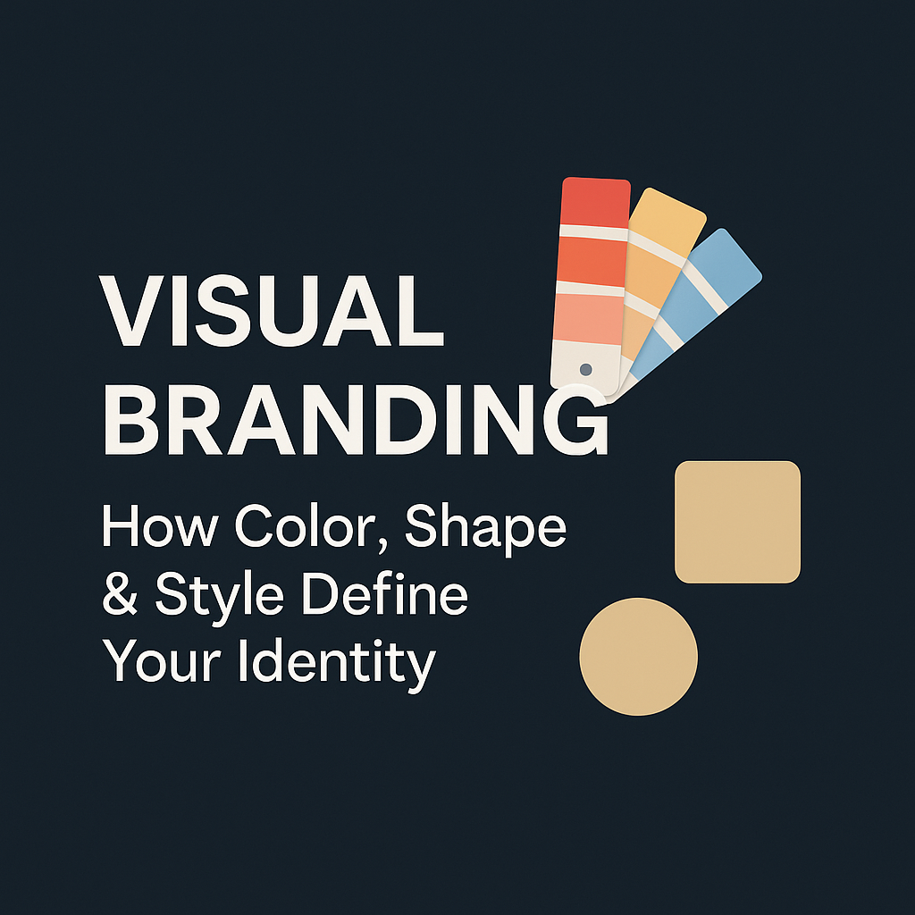
1. What Is Visual Branding? Visual branding is the collection of design elements that represent your brand’s personality. This includes your:
- Logo
- Color palette
- Fonts & typography
- Imagery & iconography
- Layout & spacing
Together, these elements create a visual language that makes your brand instantly recognizable — even without words.
Pro Insight: Brands with consistent visual identity increase revenue by up to 33% (Lucidpress).
2. The Psychology of Color in Branding Colors do more than decorate — they communicate. Each color triggers specific psychological responses.
Here’s what common brand colors convey:
- Red: Passion, urgency, power (Coca-Cola, YouTube)
- Blue: Trust, calm, intelligence (Facebook, PayPal)
- Yellow: Optimism, warmth, energy (McDonald’s, Snapchat)
- Green: Growth, health, eco-friendliness (Spotify, Whole Foods)
- Black: Luxury, authority, sophistication (Chanel, Apple)
Pro Tip: Choose 2–3 brand colors: a primary, a secondary, and an accent. Keep them consistent across all platforms.
3. Shape and Symbolism in Design Just like colors, shapes influence perception.
Shape psychology:
- Circles/Ovals: Unity, community, warmth (BMW, Pepsi)
- Squares/Rectangles: Stability, professionalism (Microsoft)
- Triangles: Power, direction, innovation (Adidas, Google Drive)
Your logo shape instantly tells the viewer what kind of personality your brand has.
Pro Tip: Keep logos scalable — simple enough to be recognized even at 16×16 pixels (favicon size).
4. Typography: The Silent Communicator Fonts are more than style — they set the tone.
Font categories & feel:
- Serif (e.g., Times New Roman): Traditional, reliable
- Sans Serif (e.g., Helvetica): Modern, clean
- Script (e.g., Pacifico): Elegant, creative
- Display (e.g., Impact): Bold, attention-grabbing
Pro Tip: Choose one primary font for headers, one for body text. Keep it legible, especially on mobile.
5. Consistency Is Key The most successful brands are consistent. Repetition builds familiarity, and familiarity builds trust.
Consistency across:
- Website design
- Blog images
- Social media templates
- Video intros/outros
- Business cards & email signatures
Create a brand style guide that includes your logo usage, colors, fonts, image tone, and spacing rules.
Pro Tip: Canva, Notion, and Figma are great for storing and sharing brand guidelines.
6. Style and Aesthetic Direction Your style sets the emotional tone of your brand. It can be:
- Minimal and modern (Apple)
- Bold and energetic (Red Bull)
- Friendly and quirky (Mailchimp)
Ask yourself:
- Is my brand casual or formal?
- Is it vibrant or muted?
- Is it playful or authoritative?
Apply this across: photography, illustrations, graphics, filters, and icon style.
7. Visual Branding in Action: Case Studies Let’s look at some brands that nailed their visual identity:
- Apple: Minimal color use, sleek lines, consistent simplicity across every touchpoint.
- Spotify: A playful green palette with sharp, bold typography. Their visuals move like music.
- Airbnb: Warm pink tones, soft shapes, inclusive iconography — reflects belonging.
These brands prove that visual identity is not just “nice to have.” It’s foundational to their emotional and commercial success.
8. Common Mistakes to Avoid
- Too many colors or fonts → Makes your brand look unprofessional
- Inconsistent social media designs → Breaks trust
- Low-res logos → Damages perceived quality
- Copying other brands → Kills originality
Pro Tip: Visual branding should reflect your unique story and audience — not trends.
9. How to Start Building Your Visual Identity If you’re starting from scratch:
Step-by-step:
- Choose your core brand values (this drives your style)
- Pick 2–3 colors based on your emotional goals
- Choose 1–2 clean fonts
- Design or hire a logo that reflects your tone
- Create 3–4 social media templates
- Build a brand kit with all assets
Tools like Canva, Looka, or Adobe Express can help you design fast without needing full Photoshop skills.
Conclusion: Your Look Is Your First Impression Your visual brand speaks before you do. Done right, it builds trust, attracts the right people, and creates emotional connection in seconds.
So don’t just look good — look intentional. Define your color palette, pick your fonts carefully, shape your visuals to tell your story, and stay consistent.
Because in branding, what people see is what they feel — and what they feel is what they trust.
Next Up on BrandWeb.net: Stay tuned for our next blog: “Beginner to Brand: A 30-Day Action Plan for New Creators”
Case Studies
How Glossier Turned Minimalist Visual Branding into a Cult Following
Overview:
Glossier, a beauty brand launched in 2014, became a sensation by doing something radical in the crowded cosmetics space — embracing minimalist, millennial-friendly visual branding that felt fresh, inclusive, and digital-first.
Visual Elements That Worked:
- Color Palette: Soft pinks, neutrals, and white space. The “Glossier pink” became iconic and instantly associated with calm, modern self-care — a stark contrast to traditional luxury or loud cosmetics branding.
- Typography: Sans-serif fonts in lower-case formatting projected simplicity, friendliness, and an anti-corporate vibe.
- Logo & Packaging: Clean, lowercase logo with minimalist packaging — often just a white tube or jar with soft pink caps. No fuss, no clutter.
- Style Direction: Social media was filled with user-generated content and minimalistic flat-lay product shots, aligning with their lifestyle-over-product narrative.
Why It Worked:
- It stood out in a saturated market that relied on glamour and excess.
- It visually represented their brand values: simplicity, skin-first beauty, and authenticity.
- It became instantly Instagrammable — a major advantage in the era of influencer marketing.
Key Lesson: Glossier’s visual identity wasn’t just about being pretty — it visually reinforced their mission and values. Every design decision supported a feeling of modern, accessible beauty, and that consistency is what turned it into a global brand.
Written by Zain Ashraf | BrandWeb.net